Dover Bay Hair
Dover Bay Beauty is a hair salon based in Nanaimo, B.C. With little existing digital presence, the rebrand provided freedom to establish a fresh, cohesive identity. The project focused on revitalizing the logo, brand visuals, and collateral to create a sophisticated yet approachable image.

Process
I had significant creative freedom with the brand since it was almost non-existent before I got involved. Initially, I wanted to experiment with hair and incorporate it into the logo. I sketched some thumbnails, but nothing felt quite right.
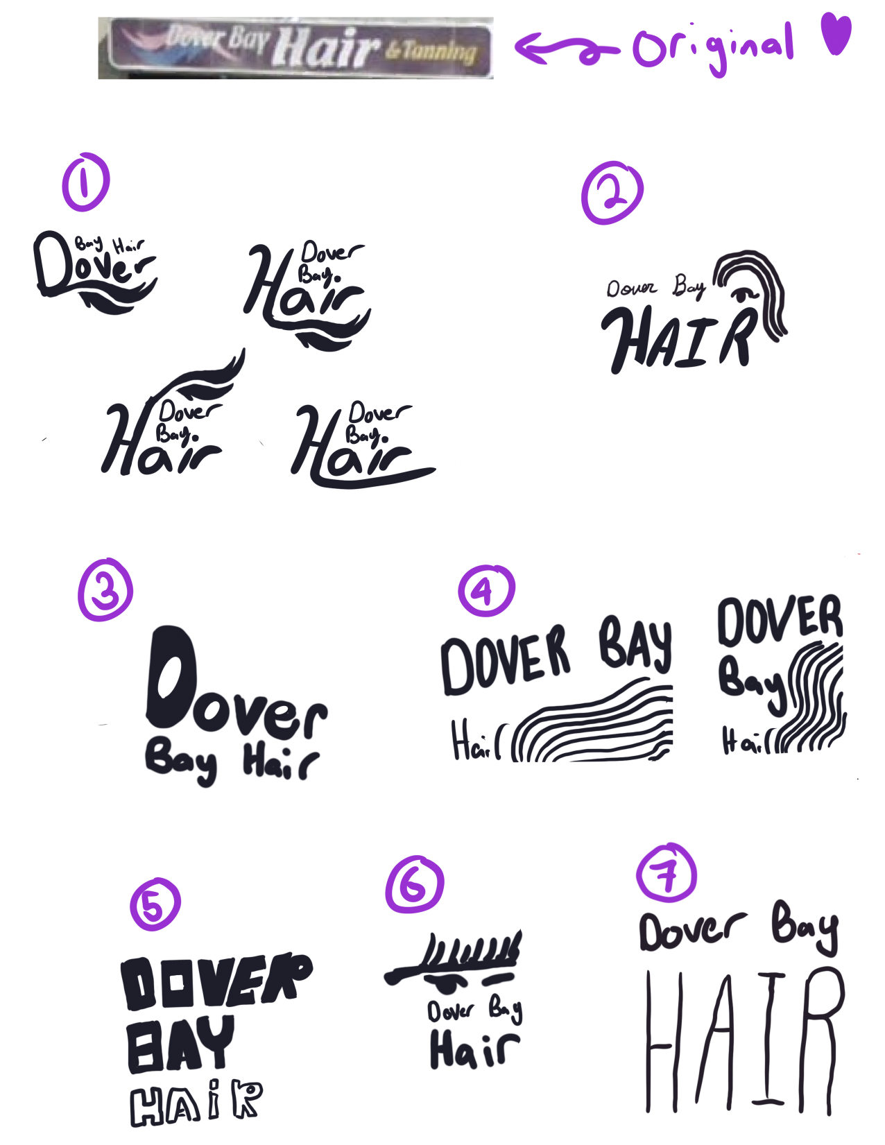
During a visit to the salon's surroundings, I noticed it was near the ocean, which inspired me to draw a shell. After editing, it started to resemble a headpiece that showgirls might wear, and I thought combining these elements would make a perfect logo motif.
The aim was to appeal to seniors while adding a fun, vibrant feel to the brand. Inspired by showgirls and floral patterns, I used shades of pink and purple to introduce femininity and charm.

Logo Redesign
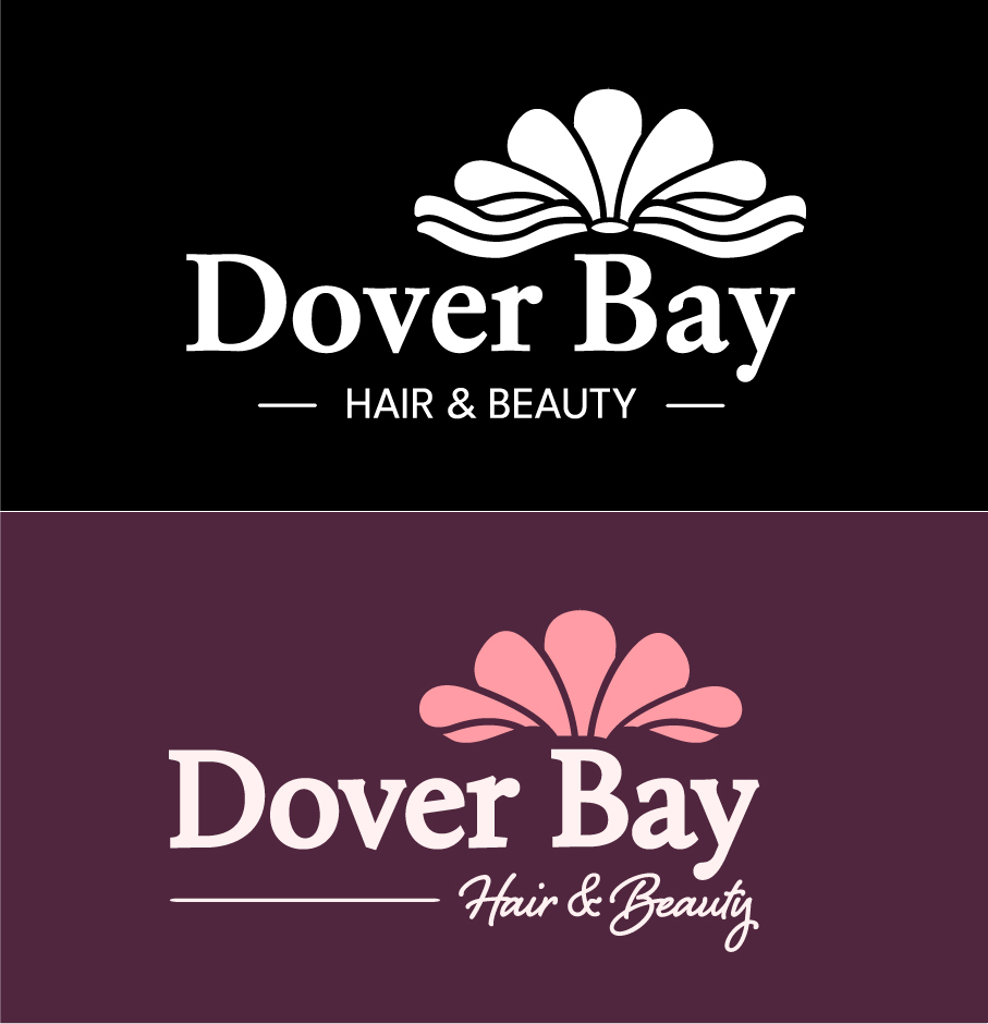
The new logo combines bold serif typography with a flowing script accent, supported by a petal-inspired motif symbolizing growth and creativity
This design balances professionalism with warmth, echoing the salon’s vision of self-expression and confidence.
- Primary Logo: A serif logotype paired with a delicate flourish, representing elegance and individuality.

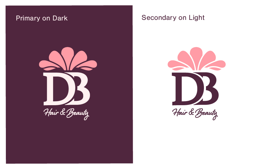
- Secondary Logo: A simplified monogram “DB” with flourish, ideal for minimal applications

Finished Product

The finished system elevates Dover Bay Beauty from a local salon without digital presence into a fully branded experience. With its vintage-inspired typography, rich colour story, and adaptable logo suite, the identity provides a foundation for future web and social media growth.
.png)